# load Packages
import os
import geopandas as gpd
import matplotlib.pyplot as plt
import rioxarray as rioxr
import xarray as xr
import pandas as pdVisualizing Fire Scars Through False Color - Creating a Fire Perimeter (Part 1)
More detailed content is available in the repository’s README.md
About
The purpose of this analysis is to save a boundary for the 2017 Thomas Fire in California as a GeoJSON, to then be added ontop of the false color image in part 2. To do this, data of all California fires will need to be downloaded, explored, filtered, and saved.
Additionally, through working through the steps above, one will gain practice loading in shapefiles, cleaning the data, and filter to the appropriate fire.
Highlights:
- Wrangling geospatial raster data using the rioxarray package
- Saving geospatial data as a GeoJSON
- Creating a true color image using the RGB (red, green, and blue) bands
- Creating a false color image by rearranging bands to incorporate near-infrared and short-wave-infrared
- Visualize the 2017 Thomas fire’s effect on AQI
The Dataset
The data is from the United States Geological Survey (USGS) and contains data for all California fire perimeters in several file formats compatible with python (GeoJSON, Shapefile, CSV, etc.). Some fires are not included due to records being lost or destroyed.
Complete Workflow
# Load Packages
import os
import geopandas as gpd
import matplotlib.pyplot as plt

# Read in California fire perimeter data
fp = os.path.join('/', 'Users', 'ejnewby', 'MEDS', 'EDS-220', 'eds220-hwk4', 'data','California_Fire_Perimeters_(all)[1].shp')
ca_fires= gpd.read_file(fp)

# Convert ca_fires column names to lower case, and remove any spaces.
ca_fires.columns = ca_fires.columns.str.lower().str.replace(' ', '_')

# Filter fires gdf to 2017 Thomas fire
thomas = ca_fires[(ca_fires['fire_name'] == 'THOMAS') & (ca_fires['year_'] == 2017)]

# Plot Thomas fire gdf
thomas.plot()

# Save Thomas fire boundary as a GeoJSON file
thomas.to_file("data/thomas.geojson", driver='GeoJSON')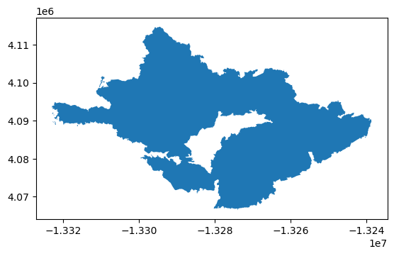
Step-by-Step Workflow
Fire perimeter data retrieval and selection
# Get current working directory
os.getcwd()'/Users/ejnewby/MEDS/EDS-220/eds220-hwk4'# Read in California fire perimeter data
fp = os.path.join('/', 'Users', 'ejnewby', 'MEDS', 'EDS-220', 'eds220-hwk4', 'data','California_Fire_Perimeters_(all)[1].shp')
ca_fires= gpd.read_file(fp)Explore data
Tidy data will make filtering to the Thomas fire easier.
# View the first 3 rows of fires df
ca_fires.head(3)| YEAR_ | STATE | AGENCY | UNIT_ID | FIRE_NAME | INC_NUM | ALARM_DATE | CONT_DATE | CAUSE | C_METHOD | OBJECTIVE | GIS_ACRES | COMMENTS | COMPLEX_NA | IRWINID | FIRE_NUM | COMPLEX_ID | DECADES | geometry | |
|---|---|---|---|---|---|---|---|---|---|---|---|---|---|---|---|---|---|---|---|
| 0 | 2023 | CA | CDF | SKU | WHITWORTH | 00004808 | 2023-06-17 | 2023-06-17 | 5 | 1 | 1 | 5.72913 | None | None | {7985848C-0AC2-4BA4-8F0E-29F778652E61} | None | None | 2020 | POLYGON ((-13682443.000 5091132.739, -13682445... |
| 1 | 2023 | CA | LRA | BTU | KAISER | 00010225 | 2023-06-02 | 2023-06-02 | 5 | 1 | 1 | 13.60240 | None | None | {43EBCC88-B3AC-48EB-8EF5-417FE0939CCF} | None | None | 2020 | POLYGON ((-13576727.142 4841226.161, -13576726... |
| 2 | 2023 | CA | CDF | AEU | JACKSON | 00017640 | 2023-07-01 | 2023-07-02 | 2 | 1 | 1 | 27.81450 | None | None | {B64E1355-BF1D-441A-95D0-BC1FBB93483B} | None | None | 2020 | POLYGON ((-13459243.000 4621236.000, -13458968... |
# ca_fires df info
ca_fires.info()
<class 'geopandas.geodataframe.GeoDataFrame'>
RangeIndex: 22261 entries, 0 to 22260
Data columns (total 19 columns):
# Column Non-Null Count Dtype
--- ------ -------------- -----
0 YEAR_ 22261 non-null int64
1 STATE 22261 non-null object
2 AGENCY 22208 non-null object
3 UNIT_ID 22194 non-null object
4 FIRE_NAME 15672 non-null object
5 INC_NUM 21286 non-null object
6 ALARM_DATE 22261 non-null object
7 CONT_DATE 22261 non-null object
8 CAUSE 22261 non-null int64
9 C_METHOD 22261 non-null int64
10 OBJECTIVE 22261 non-null int64
11 GIS_ACRES 22261 non-null float64
12 COMMENTS 2707 non-null object
13 COMPLEX_NA 596 non-null object
14 IRWINID 2695 non-null object
15 FIRE_NUM 17147 non-null object
16 COMPLEX_ID 360 non-null object
17 DECADES 22261 non-null int64
18 geometry 22261 non-null geometry
dtypes: float64(1), geometry(1), int64(5), object(12)
memory usage: 3.2+ MBClean data
This will help with filtering in the next step.
# Convert ca_fires column names to lower case, and remove any spaces.
ca_fires.columns = ca_fires.columns.str.lower().str.replace(' ', '_')
# Check the outputs
ca_fires.head(3)| year_ | state | agency | unit_id | fire_name | inc_num | alarm_date | cont_date | cause | c_method | objective | gis_acres | comments | complex_na | irwinid | fire_num | complex_id | decades | geometry | |
|---|---|---|---|---|---|---|---|---|---|---|---|---|---|---|---|---|---|---|---|
| 0 | 2023 | CA | CDF | SKU | WHITWORTH | 00004808 | 2023-06-17 | 2023-06-17 | 5 | 1 | 1 | 5.72913 | None | None | {7985848C-0AC2-4BA4-8F0E-29F778652E61} | None | None | 2020 | POLYGON ((-13682443.000 5091132.739, -13682445... |
| 1 | 2023 | CA | LRA | BTU | KAISER | 00010225 | 2023-06-02 | 2023-06-02 | 5 | 1 | 1 | 13.60240 | None | None | {43EBCC88-B3AC-48EB-8EF5-417FE0939CCF} | None | None | 2020 | POLYGON ((-13576727.142 4841226.161, -13576726... |
| 2 | 2023 | CA | CDF | AEU | JACKSON | 00017640 | 2023-07-01 | 2023-07-02 | 2 | 1 | 1 | 27.81450 | None | None | {B64E1355-BF1D-441A-95D0-BC1FBB93483B} | None | None | 2020 | POLYGON ((-13459243.000 4621236.000, -13458968... |
Now that the data has been cleaned, let’s filter the ca_fires geodataframe to the 2017 Thomas fire and plot the output.
# Filter fires gdf to 2017 Thomas fire
thomas = ca_fires[(ca_fires['fire_name'] == 'THOMAS') & (ca_fires['year_'] == 2017)]
# CRS of thomas gdf
thomas.crs<Projected CRS: EPSG:3857>
Name: WGS 84 / Pseudo-Mercator
Axis Info [cartesian]:
- X[east]: Easting (metre)
- Y[north]: Northing (metre)
Area of Use:
- name: World between 85.06°S and 85.06°N.
- bounds: (-180.0, -85.06, 180.0, 85.06)
Coordinate Operation:
- name: Popular Visualisation Pseudo-Mercator
- method: Popular Visualisation Pseudo Mercator
Datum: World Geodetic System 1984 ensemble
- Ellipsoid: WGS 84
- Prime Meridian: Greenwich# Plot the Thomas fire gdf
thomas.plot()
Data filtering and exploration reflection:
I chose the shapefile data from data.gov, as this was one of the first websites I found that was not through an ESRI platform. I chose to upload the shapefiles as this is what I had used in the past while working, and wanted more practice with what I had experienced in the industry.
Through the preliminary exploration, I was able to determine that the coordinate reference system is EPSG:4326, which is WGS 84, and that the coordinate system is projected. Additionally, viewing the datatypes was helpful to determine if any column data types needed to be changed (none needed changing).
Now that the correct Thomas fire boundary has been filtered to, let’s save the file as a GeoJSON to be used in the fire scar portion of the analysis.
# Save Thomas fire boundary as a GeoJSON file
thomas.to_file("data/thomas.geojson", driver='GeoJSON')
Visualizing Fire Scars Through False Color - Create a False Color Image (Part 2)
About
The purpose of this analysis is to create a false color image of southern Santa Barbara county using landsat data in the .nc file format, and overlay the 2017 Thomas fire boundary GeoJSON. The goal is to observe how the false color imagery illuminates the 2017 Thomas fire scar, and if that matches well with the boundary.
Additionally, practice with the rioxarray package and working with geoJSON files are important aspects of this assignment.
The Dataset
The data is from the Landsat Collection 2 Level-2 atmosperically corrected surface reflectance data, collected by the Landsat 8 satellite, and contains several bands (red, green, blue, near-infrared and shortwave infrared). This dataset was retrieved from the Microsoft Planetary Computer data catalogue and pre-processed to remove data outside land and coarsen the spatial resolution.
Complete Workflow
# Load Packages
import os
import matplotlib.pyplot as plt
import geopandas as gpd
import rioxarray as rioxr
import xarray as xr

# Import .nc file using rioxr.open_rasterio
fp2 = os.path.join('/', 'Users', 'ejnewby', 'MEDS', 'EDS-220', 'eds220-hwk4', 'data','landsat8-2018-01-26-sb-simplified.nc')
landsat = rioxr.open_rasterio(fp2)

# Drop the band dimension of the data using squeeze() and drop_vars().
landsat = landsat.squeeze().drop_vars('band')

# Read-in thomas fire GeoJSON from part 1 notebook
fp3 = os.path.join('/', 'Users', 'ejnewby', 'MEDS', 'EDS-220', 'eds220-hwk4', 'data','thomas.geojson')
thomas = gpd.read_file(fp3)

# Change landsat to Projected CRS: EPSG:3857, since that matches the Thomas fire bounday
landsat = landsat.rio.reproject("EPSG:3857")

# Plot Landsat and Fire boundary data
fig, ax = plt.subplots(figsize = (10, 10))

landsat[['swir22', 'nir08', 'red']].to_array().plot.imshow(ax = ax, robust = True)

thomas.boundary.plot(ax = ax, edgecolor = 'blue', linewidth = 2, label="Thomas Fire Boundary")

ax.legend()

ax.set_title('2017 Thomas Fire Boundary Over False Color Imagery in Southwest Santa Barbara County, CA',
             fontsize = 12)

plt.show()
Step-by-Step Workflow:
Import Landsat Data (using server file path)
Explore data
# Import .nc file using rioxr.open_rasterio
fp2 = os.path.join('/', 'Users', 'ejnewby', 'MEDS', 'EDS-220', 'eds220-hwk4', 'data','landsat8-2018-01-26-sb-simplified.nc')
landsat = rioxr.open_rasterio(fp2)
# View the landsat dataset
landsat<xarray.Dataset> Size: 25MB
Dimensions: (band: 1, x: 870, y: 731)
Coordinates:
* band (band) int64 8B 1
* x (x) float64 7kB 1.213e+05 1.216e+05 ... 3.557e+05 3.559e+05
* y (y) float64 6kB 3.952e+06 3.952e+06 ... 3.756e+06 3.755e+06
spatial_ref int64 8B 0
Data variables:
red (band, y, x) float64 5MB ...
green (band, y, x) float64 5MB ...
blue (band, y, x) float64 5MB ...
nir08 (band, y, x) float64 5MB ...
swir22 (band, y, x) float64 5MB ...# View landsat dimensions
landsat.dimsFrozenMappingWarningOnValuesAccess({'band': 1, 'x': 870, 'y': 731})Data summary: - The variables are red, green, blue, nir08 (nir-infrared), and swir22(short-wave infrared). - The dimensions are 1 spectral band, 870 rows (height), and 731 columns (width)
True color image
Before creating a false color image, let’s see what the true color image looks like. To create a true color image, the band dimensionss will need to be dropped.
# Drop the band dimension of the data using squeeze() and drop_vars().
landsat = landsat.squeeze().drop_vars('band')

# Confirm drop and squeeze
landsat
<xarray.Dataset> Size: 25MB
Dimensions: (x: 870, y: 731)
Coordinates:
* x (x) float64 7kB 1.213e+05 1.216e+05 ... 3.557e+05 3.559e+05
* y (y) float64 6kB 3.952e+06 3.952e+06 ... 3.756e+06 3.755e+06
spatial_ref int64 8B 0
Data variables:
red (y, x) float64 5MB ...
green (y, x) float64 5MB ...
blue (y, x) float64 5MB ...
nir08 (y, x) float64 5MB ...
swir22 (y, x) float64 5MB ...Now that the bands have been dropped, let’s select the red, green, and blue bands for plotting.
# Select red, green, and blue bands, convert to an array using `.to_array()`, and plot using `.imshow()`

xr.Dataset(landsat[['red','green','blue']]).to_array().plot.imshow()
Clipping input data to the valid range for imshow with RGB data ([0..1] for floats or [0..255] for integers).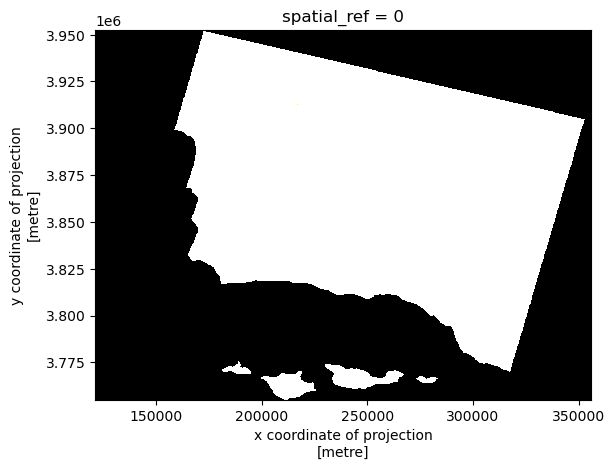
Why is the above plot in black and white only? This is due to the robust parameter within .imshow().
# Adjust scale by setting robust parameter to true.
xr.Dataset(landsat[['red','green','blue']]).to_array().plot.imshow(robust=True)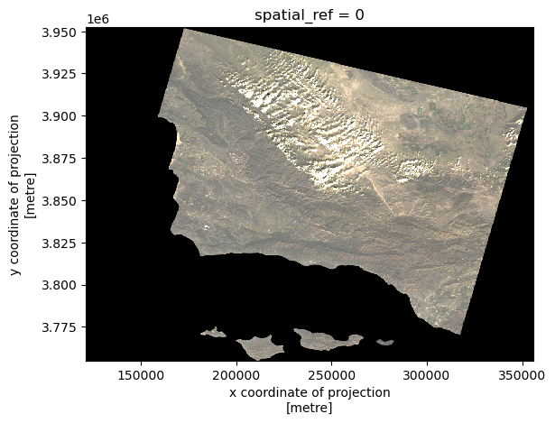
Compare the ouputs:
The first part gives a black and white output, while the second part gives the true colors. This is due to the robust parameter, which adjusts the color scale using data percentiles instead of minimum and maximum values, therefore excluding some extreme outliers that were influencing the scaling of the image as observed in part a.
False color image
Now that we’ve seen the true color image, let’s create a false color image. To create a false color image for the true color image above, the short-wave infrared, near wave infrared, and red variables will need to be plotted in that order.
# Create a false color image by plotting swir22, nir08, and red.
landsat_false = xr.Dataset(landsat[['swir22','nir08','red']]).to_array().plot.imshow(robust = True)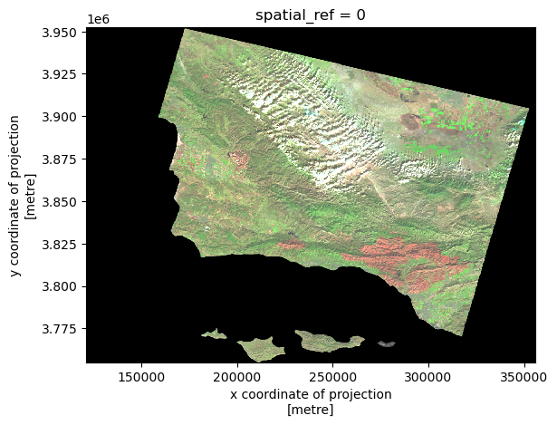
Map the results
Now that we have a false color image with a fire scar in the southwestern section of the image, let’s load in the 2017 Thomas fire perimeter GeoJson ontop. From this map, we can observe how closely the fire perimeter matches with the fire scar.
Check the CRS’ for both geodataframes to ensure plotting compatibility.
# Read-in thomas fire data from above
fp3 = os.path.join('/', 'Users', 'ejnewby', 'MEDS', 'EDS-220', 'eds220-hwk4', 'data','thomas.geojson')
thomas = gpd.read_file(fp3)
# Check CRS of thomas fire boundary data
print(f"{'The CRS of the landsat data is':<27}{thomas.crs}")The CRS of the landsat data isEPSG:3857# Check CRS for landsat data
print(f"{'The CRS of the landsat data is':<27}{landsat.rio.crs}")The CRS of the landsat data isEPSG:32611# Change landsat to Projected CRS: EPSG:3857, since that matches the Thomas fire bounday
landsat = landsat.rio.reproject("EPSG:3857")
# Verify change
print(f"{'The CRS of the landsat data is':<27}{landsat.rio.crs}")
print(f"{'The CRS of the landsat data is':<27}{thomas.crs}")The CRS of the landsat data isEPSG:3857
The CRS of the landsat data isEPSG:3857Now that the CRS’ are confirmed to match, let’s plot!
# Plot Landsat and Fire boundary data
fig, ax = plt.subplots(figsize = (10, 10))

landsat[['swir22', 'nir08', 'red']].to_array().plot.imshow(ax = ax, robust = True)

thomas.boundary.plot(ax = ax, edgecolor = 'blue', linewidth = 2, label="Thomas Fire Boundary")

ax.legend()

ax.set_title('2017 Thomas Fire Boundary Over False Color Imagery in Southwest Santa Barbara County, CA',
             fontsize = 12)

plt.show()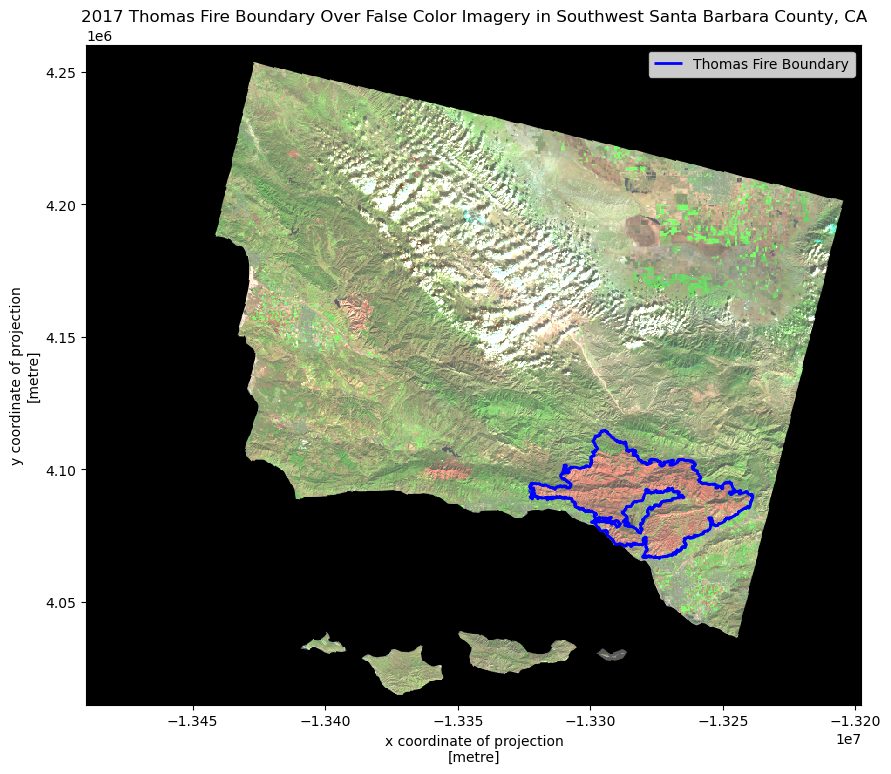
Map description:
The map above shows how false color imagery is being used to greater illuminate the 2017 Thomas fire boundary. As areas that were burned more recently will have different and younger vegetation (also more likely to have non-native species after burning), the chlorophyll content of the vegetation differences will show more drastically in a false color image than a true color image as they reflect different wavelengths back, which cannot be seen in the visible spectrum. One can see how the 2017 Thomas fire boundary matches up pretty closely with the burned areas showing up as orange-red.
Visualizing Air Quality Index (AQI) during the 2017 Thomas Fire in Santa Barbara County
About
The 2017 Thomas fire devastated the Santa Barbara region, burning 281,893 acres over 39 days and completely surrounded the Ojai region and skyrocketing the AQI. The purpose of this analysis is to visualize the impact of the AQI on the 2017 Thomas Fire in Santa Barbara County.
The Dataset
In this task you will use Air Quality Index (AQI) data from the US Environmental Protection Agency. The data is located at the EPA’s website on Air Quality Data Collected at Outdoor Monitors Across the US.
Instructions to Read-in Data from the URL:
Under “Donwload Data”, click on “Pre-generated Data Files”, then click on “Tables of Daily AQI”. Copy the URL to the 2017 Daily AQI by County ZIP file daily_aqi_by_county_2017.zip. Then, read in the data from the URL using the pd.read_csv function with the compression='zip' parameter added and store it as aqi_17. Do the same for 2018.
Complete Workflow
import pandas as pd
import matplotlib.pyplot as plt

# Read in data
aqi_17 = pd.read_csv("https://aqs.epa.gov/aqsweb/airdata/daily_aqi_by_county_2017.zip", compression='zip')
aqi_18 = pd.read_csv("https://aqs.epa.gov/aqsweb/airdata/daily_aqi_by_county_2018.zip", compression='zip')

# Glue 2017 and 2018 data together
aqi = pd.concat([aqi_17, aqi_18])

# Initial column names: notice caps and spaces (difficult to work with!)
print(aqi.columns, '\n') # View names of columns, with a new line.

# Simplify column names
aqi.columns = (aqi.columns # column names
                  .str.lower() # convert to lower case
                  .str.replace(' ','_') # remove blank space by putting a "_" instead
                )
print(aqi.columns, '\n') # View names of columns, with a new line.

# Select only from SB county
aqi_sb = aqi[aqi['county_name'] == "Santa Barbara"]

# Drop specified columns
aqi_sb = aqi_sb.drop(['state_name', 'county_name', 'state_code', 'county_code'], axis=1)

# Update to pandas.datetime object
aqi_sb.date = pd.to_datetime(aqi_sb['date'])

# Update the index
aqi_sb = aqi_sb.set_index('date')

# Calculate AQI rolling average over 5 days
rolling_average = aqi_sb['aqi'].rolling('5D').mean()

# Add mean of AQI over 5-day rolling window to a new column
aqi_sb['five_day_average'] = rolling_average

# Create AQI plot
ax = aqi_sb[['aqi', 'five_day_average']].plot(xlabel='Year',
                                              ylabel='Air Quality Index (AQI)',
                                              title='Air Quality Index (AQI) from 2017-2018')

# Updating the legend with custom labels
ax.legend(['Daily AQI', '5-Day Average AQI'], loc='upper right')

# Show the plot
plt.show()
Index(['State Name', 'county Name', 'State Code', 'County Code', 'Date', 'AQI',
'Category', 'Defining Parameter', 'Defining Site',
'Number of Sites Reporting'],
dtype='object')
Index(['state_name', 'county_name', 'state_code', 'county_code', 'date', 'aqi',
'category', 'defining_parameter', 'defining_site',
'number_of_sites_reporting'],
dtype='object')

Step-by-Step Workflow
Import Data
This data is located on the EPA’s website and can be accessed from the links below.
# Read in data
aqi_17 = pd.read_csv("https://aqs.epa.gov/aqsweb/airdata/daily_aqi_by_county_2017.zip", compression='zip')
aqi_18 = pd.read_csv("https://aqs.epa.gov/aqsweb/airdata/daily_aqi_by_county_2018.zip", compression='zip')
Explore data
# First 3 rows of 2017 dataset
aqi_17.head(3)| State Name | county Name | State Code | County Code | Date | AQI | Category | Defining Parameter | Defining Site | Number of Sites Reporting | |
|---|---|---|---|---|---|---|---|---|---|---|
| 0 | Alabama | Baldwin | 1 | 3 | 2017-01-01 | 28 | Good | PM2.5 | 01-003-0010 | 1 |
| 1 | Alabama | Baldwin | 1 | 3 | 2017-01-04 | 29 | Good | PM2.5 | 01-003-0010 | 1 |
| 2 | Alabama | Baldwin | 1 | 3 | 2017-01-10 | 25 | Good | PM2.5 | 01-003-0010 | 1 |
# First 3 rows of 2018 dataset
aqi_18.head(3)| State Name | county Name | State Code | County Code | Date | AQI | Category | Defining Parameter | Defining Site | Number of Sites Reporting | |
|---|---|---|---|---|---|---|---|---|---|---|
| 0 | Alabama | Baldwin | 1 | 3 | 2018-01-02 | 42 | Good | PM2.5 | 01-003-0010 | 1 |
| 1 | Alabama | Baldwin | 1 | 3 | 2018-01-05 | 45 | Good | PM2.5 | 01-003-0010 | 1 |
| 2 | Alabama | Baldwin | 1 | 3 | 2018-01-08 | 20 | Good | PM2.5 | 01-003-0010 | 1 |
# More detailed information from `info` for 2017
aqi_17.info()
<class 'pandas.core.frame.DataFrame'>
RangeIndex: 326801 entries, 0 to 326800
Data columns (total 10 columns):
# Column Non-Null Count Dtype
--- ------ -------------- -----
0 State Name 326801 non-null object
1 county Name 326801 non-null object
2 State Code 326801 non-null int64
3 County Code 326801 non-null int64
4 Date 326801 non-null object
5 AQI 326801 non-null int64
6 Category 326801 non-null object
7 Defining Parameter 326801 non-null object
8 Defining Site 326801 non-null object
9 Number of Sites Reporting 326801 non-null int64
dtypes: int64(4), object(6)
memory usage: 24.9+ MB# More detailed information from `info` for 2018
aqi_18.info()<class 'pandas.core.frame.DataFrame'>
RangeIndex: 327543 entries, 0 to 327542
Data columns (total 10 columns):
# Column Non-Null Count Dtype
--- ------ -------------- -----
0 State Name 327543 non-null object
1 county Name 327543 non-null object
2 State Code 327543 non-null int64
3 County Code 327543 non-null int64
4 Date 327543 non-null object
5 AQI 327543 non-null int64
6 Category 327543 non-null object
7 Defining Parameter 327543 non-null object
8 Defining Site 327543 non-null object
9 Number of Sites Reporting 327543 non-null int64
dtypes: int64(4), object(6)
memory usage: 25.0+ MBWhy explore?
df.info() and df.head(3) give the amount and number of categories, the class, and number of entries as well as the first 3 rows. Knowing the data types of each column may also be helpful information for the future operations we want to perform.
Combining data frames
We currently have two separate data frames. We will need to “glue” them one on top of the other for our analysis. The pandas function pd.concat() can achieve this.
# Glue 2017 and 2018 data together
aqi = pd.concat([aqi_17, aqi_18])

# View data frame
aqi| State Name | county Name | State Code | County Code | Date | AQI | Category | Defining Parameter | Defining Site | Number of Sites Reporting | |
|---|---|---|---|---|---|---|---|---|---|---|
| 0 | Alabama | Baldwin | 1 | 3 | 2017-01-01 | 28 | Good | PM2.5 | 01-003-0010 | 1 |
| 1 | Alabama | Baldwin | 1 | 3 | 2017-01-04 | 29 | Good | PM2.5 | 01-003-0010 | 1 |
| 2 | Alabama | Baldwin | 1 | 3 | 2017-01-10 | 25 | Good | PM2.5 | 01-003-0010 | 1 |
| 3 | Alabama | Baldwin | 1 | 3 | 2017-01-13 | 40 | Good | PM2.5 | 01-003-0010 | 1 |
| 4 | Alabama | Baldwin | 1 | 3 | 2017-01-16 | 22 | Good | PM2.5 | 01-003-0010 | 1 |
| ... | ... | ... | ... | ... | ... | ... | ... | ... | ... | ... |
| 327538 | Wyoming | Weston | 56 | 45 | 2018-12-27 | 36 | Good | Ozone | 56-045-0003 | 1 |
| 327539 | Wyoming | Weston | 56 | 45 | 2018-12-28 | 35 | Good | Ozone | 56-045-0003 | 1 |
| 327540 | Wyoming | Weston | 56 | 45 | 2018-12-29 | 35 | Good | Ozone | 56-045-0003 | 1 |
| 327541 | Wyoming | Weston | 56 | 45 | 2018-12-30 | 31 | Good | Ozone | 56-045-0003 | 1 |
| 327542 | Wyoming | Weston | 56 | 45 | 2018-12-31 | 35 | Good | Ozone | 56-045-0003 | 1 |
654344 rows × 10 columns
When we concatenate data frames like this, without any extra parameters for pd.concat() the indices for the two dataframes are just “glued together”, the index of the resulting dataframe is not updated to start from 0. Notice the mismatch between the index of aqi and the number of rows in the complete data frame.
Clean data
Cleaning the data’s column names will
# Initial column names
print(aqi.columns, '\n') # View names of columns, with a new line.

# Simplify column names
aqi.columns = (aqi.columns # column names
                  .str.lower() # convert to lower case
                  .str.replace(' ','_') # remove blank space by putting a "_" instead
                )
print(aqi.columns, '\n') # View names of columns, with a new line.
Index(['State Name', 'county Name', 'State Code', 'County Code', 'Date', 'AQI',
'Category', 'Defining Parameter', 'Defining Site',
'Number of Sites Reporting'],
dtype='object')
Index(['state_name', 'county_name', 'state_code', 'county_code', 'date', 'aqi',
'category', 'defining_parameter', 'defining_site',
'number_of_sites_reporting'],
dtype='object')
Now that our column names are simplified, let’s select only data from Santa Barbara county and store it in a new variable aqi_sb.
Remove the state_name, county_name, state_code and county_code columns from aqi_sb. The dataframe should have the following columns in this order: date, aqi, category, defining_parameter, defining_stie, number_of_sites_reporting.
# Select only from SB county
aqi_sb = aqi[aqi['county_name'] == "Santa Barbara"]

# Drop specified columns
aqi_sb = aqi_sb.drop(['state_name', 'county_name', 'state_code', 'county_code'], axis=1)

aqi_sb| date | aqi | category | defining_parameter | defining_site | number_of_sites_reporting | |
|---|---|---|---|---|---|---|
| 28648 | 2017-01-01 | 39 | Good | Ozone | 06-083-4003 | 12 |
| 28649 | 2017-01-02 | 39 | Good | PM2.5 | 06-083-2011 | 11 |
| 28650 | 2017-01-03 | 71 | Moderate | PM10 | 06-083-4003 | 12 |
| 28651 | 2017-01-04 | 34 | Good | Ozone | 06-083-4003 | 13 |
| 28652 | 2017-01-05 | 37 | Good | Ozone | 06-083-4003 | 12 |
| ... | ... | ... | ... | ... | ... | ... |
| 29128 | 2018-12-27 | 37 | Good | Ozone | 06-083-1025 | 11 |
| 29129 | 2018-12-28 | 39 | Good | Ozone | 06-083-1021 | 12 |
| 29130 | 2018-12-29 | 39 | Good | Ozone | 06-083-1021 | 12 |
| 29131 | 2018-12-30 | 41 | Good | PM2.5 | 06-083-1008 | 12 |
| 29132 | 2018-12-31 | 38 | Good | Ozone | 06-083-2004 | 12 |
730 rows × 6 columns
Next, we need to convert to pandas.datetime and update index.
To create a 5-day rolling average of AQI in the next section, the date column of aqi_sb needs to be updated to a pandas.datetime object and the index needs to be set to date.
# Update to pandas.datetime object
aqi_sb.date = pd.to_datetime(aqi_sb['date'])

# Update the index
aqi_sb = aqi_sb.set_index('date')
Next, we need to create a rolling average over 5 days. This is best accomplished using the rolling()method for pandas.Series:
- Specify what we want to calculate over each window.
- Use the aggregator function
mean()to calculate the average over each window - the parameter ‘5D’ indicates the window for our rolling average is 5 days.
- Ouput is a
pandas.Series
# Calculate AQI rolling average over 5 days
rolling_average = aqi_sb['aqi'].rolling('5D').mean()

# View values
rolling_average
date
2017-01-01 39.000000
2017-01-02 39.000000
2017-01-03 49.666667
2017-01-04 45.750000
2017-01-05 44.000000
...
2018-12-27 41.200000
2018-12-28 38.600000
2018-12-29 38.200000
2018-12-30 38.200000
2018-12-31 38.800000
Name: aqi, Length: 730, dtype: float64Now that we have the 5 day rolling averages, let’s add the means to a new column.
# Add mean of AQI over 5-day rolling window to a new column
aqi_sb['five_day_average'] = rolling_average

# View data frame to confirm new column
aqi_sb.head(3)| aqi | category | defining_parameter | defining_site | number_of_sites_reporting | five_day_average | |
|---|---|---|---|---|---|---|
| date | ||||||
| 2017-01-01 | 39 | Good | Ozone | 06-083-4003 | 12 | 39.000000 |
| 2017-01-02 | 39 | Good | PM2.5 | 06-083-2011 | 11 | 39.000000 |
| 2017-01-03 | 71 | Moderate | PM10 | 06-083-4003 | 12 | 49.666667 |
Vizualize
One way to visualize the data is to create a line plot showing both the daily AQI and the 5-day average (5-day average on top of the AQI).
# Create AQI plot
ax = aqi_sb[['aqi', 'five_day_average']].plot(xlabel='Year',
                                              ylabel='Air Quality Index (AQI)',
                                              title='Air Quality Index (AQI) from 2017-2018')

# Updating the legend with custom labels
ax.legend(['Daily AQI', '5-Day Average AQI'], loc='upper right')

# Show the plot
plt.show()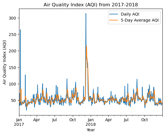
Description:
Note the AQI spike in December at the time of the Thomas fire. The spike is less pronounced with the five-day average, but still very noticeable. It appears that the AQI returned to normal levels once the fire was extinguished.
Conclusion
If you’ve made it this far in my blog post- thank you! I hope you learned something new about the 2017 Thomas fire, false color imagery, fire scars, and AQI.
Data References
California Department of Forestry and Fire Protection. (2017, December 4). Thomas Fire. California Department of Forestry and Fire Protection. https://www.fire.ca.gov/incidents/2017/12/4/thomas-fire
Microsoft. Landsat C2 L2 dataset. Planetary Computer. Retrieved November 19, 2024, from https://planetarycomputer.microsoft.com/dataset/landsat-c2-l2
U.S. Geological Survey (USGS). (2020). California Fire Perimeters (ALL). Data.gov. Retrieved November 19, 2024, from https://catalog.data.gov/dataset/california-fire-perimeters-all-b3436
No matching items