Why Loggerhead Sea Turtles?
It all started in 2002, on Hawaii’s Big Island. I was 5 years old and just gotten back from snorkeling with my parents. The best part? The sea turtles, swimming gracefully amongst the coral reefs! Right then and there, I decided that sea turtles were my favorite animal. The next year, “Finding Nemo” came out in theaters and you better believe my excitement was out of this world when Marlin and Dory met Crush and Squirt and continued on their adventure to Sydney. The seed was planted and my personal love of sea turtles only grew as I matured and chose a career in the natural and data sciences.
Yes, sea turtles are cool to look at, but they also serve as ecosystem indicators. Their well-being, nesting trends, and overall health often reflect the health of their ocean and beach habitats. According to the International Union for Conservation of Nature (IUCN) and the U.S. Endangered Species Act (ESA), 6 out of the 7 species of sea turtle are listed as threatened, endangered, or critically endangered. Of these 6 species, loggerhead sea turtles (Caretta caretta) are one of the more widespread in range, as they inhabit beaches throughout temperate regions worldwide and are a highly migratory species. Loggerheads are listed as “vulnerable” on the IUCN red list, with a decreasing population.
Ocean warming and it’s impacts are hot topics in today’s political climate. As is the case with many reptilian species, the gender of loggerhead clutches are largely determined by temperature, with warmer temperatures generally leading to more female-dominant clutches. Sex imbalance can be an issue for future genetic viability of a population. Assessing loggerhead nesting trends is one way to determine how loggerheads might be affected by ocean warming, and potentially open up more avenues for research into ocean ecosystem health. Variation in loggerhead nesting between beaches may also lend insight into how certain beaches are handling climate change.
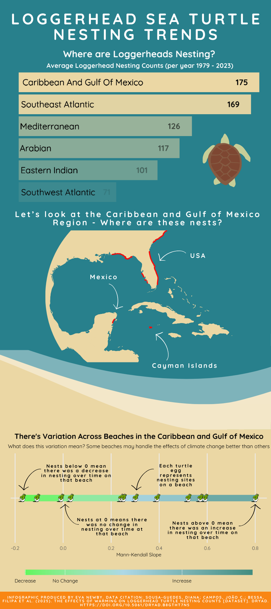
Key Questions: Where are loggerheads nesting around the world? Is loggerhead nesting changing over time and if so, how?
The data set used to address these questions is from “The effects of warming on loggerhead turtle nesting counts”, by Sousa-Guedes et al (2025) published on Dryad.
The data set contains 3 key variables:
Mann-Kendall: This number quantifies how much change in loggerhead turtle nesting (increase or decrease) a beach or region experienced. More on this in Question 3.
rmu and country: Regional Management Unit, this number was used to assign countries to regions. I created a regions column from the data from the rmu and country column.
GEOMETRY: Shapefile geometry for each beach/stretch of beach where nests were found.
Design elements:
For all three visualizations, I chose the font “quicksilver” as it just felt beachy (and legible). The theme elements for all three visualizations were refined with their color palette. Blues and sandy colors were selected to match the ocean theme, which also provide context for the entire info graphic. Additionally, text elements were modified in the theme for visualizations 1 and 3 for improved legibility.
The progression of the visualizations are laid out so that the reader should follow intuitively. Question 1 is broad; Question 2 is a bit more narrow building off of Question 1, and Question 3 is very narrow, also building off of the first two.
Impact
Many local, indigenous, and tourist communities are heavily involved in the places represented in this info graphic. Tourism is a large component of funding sea turtle conservation research throughout the Caribbean and Gulf of Mexico, and should be promoted with sustainability, animal welfare, and local community impact in mind first.
The Infographic
I used Canva to assemble all three plots into an informative infographic. I found their tools easy to use and it worked nicely with R.
Question 1: Where in the world are loggerheads nesting?
To answer this question, I chose a bar chart, axes flipped, with a opacity value to represent frequency of nesting. The emphasis on this visualization is the top regions with the highest amount of nesting sites. I particularly want to draw attention to the Caribbean/Gulf of Mexico region, as the other two visualizations build on this region.
Question 2: More specifically, WHERE are these nests?
To best answer this question, I designed a map with the shape-files on top. All titles and text were ultimately removed, as they felt more like a distraction and took away from the map. The titles were then placed above the map in the info graphic, country annotations and arrows were added for further clarification.
Question 3: How has Loggerhead nesting changed over time for different beaches?
As the data set did not provide a “year” column, the change over time element was present in the “mann-kendall” score column. The mann-kendall score, ranging from -0.2 to 0.8, tells us how nesting at a certain beach changed. Values below zero indicate that there was a decrease in nesting activity over time for a beach, values at zero indicate that there was no significant change over time fo a beach, and values above 0 indicate that there was an increase in nesting over time for a beach.
To best represent this data, I selected a line graph with a color gradient, and added in turtle nesting points (as a turtle hatching out of a shell icon) to represent each nesting site on a beach. Similar to visualization 2, annotations with arrows were added in for specific clarification.
Code
All code for each of the infographic elements can be found in the code chunk below:
Code
# Load libraries
library(tidyverse)
library(dplyr)
library(sf)
library(ggspatial)
library(rnaturalearth)
library(rnaturalearthdata)
library(ggimage)
library(showtext)
library(grid)

# Read in Turtle nesting data and font data --------------------------------------------------------------------------------------
# Set the SHAPE_RESTORE_SHX config option
Sys.setenv("SHAPE_RESTORE_SHX" = "YES")

# Read the shapefile
shapefile_path <- "C:/MEDS/EDS240-dataviz/Assignments/newby-eds240-HW4/data/nestingbeaches_GCB.shp"
turtles <- st_read(shapefile_path) %>%
    janitor::clean_names()

# Font options from google
font_add_google("Quicksand", "quicksand")
showtext_auto()

# Data Wrangling ------------------------------------------------------------------------------------------------------------
# Check CRS
st_crs(turtles)

# Assume data into regional names
turtles <- turtles %>%
    mutate(region = case_when(rmu == 1 ~ "Caribbean and Gulf of Mexico",
                              rmu == 2 ~ "Southwest Atlantic",
                              rmu == 3 ~ "Southeast Atlantic",
                              rmu == 4 ~ "Mediterranean",
                              rmu == 5 ~ "Arabian",
                              rmu == 8 ~ "Eastern Indian",
                              TRUE ~ "Unknown")) %>%
    filter(region %in% c('Caribbean and Gulf of Mexico', 'Southeast Atlantic', 'Mediterranean', 'Arabian', 'Eastern Indian', 'Southwest Atlantic'))

# Summarize unique nest counts per region
region_counts <- turtles %>%
    st_drop_geometry() %>%
    group_by(region) %>%
    summarize(nest_count = n()) %>%  # Count occurrences per region
    mutate(opacity_val = nest_count / max(nest_count))  # Normalize opacity (0-1)

# Join back to original data (so each region has its unique opacity)
turtles <- turtles %>%
    left_join(region_counts, by = "region")

# Q1: World regions represented and their average nest count per year. -------------------------------------------------------------------------------

turtle_bar_plot <- turtles %>%

    ggplot(aes(x = fct_rev(fct_infreq(region)),
               alpha = opacity_val))+

    geom_bar(fill = "#EBD7A4") +

    geom_text(stat = 'count',
              aes(label=after_stat(count)),
              hjust = 2,
              size = 12,
              color = "black",
              family = 'quicksand',
              fontface = "bold")+

    coord_flip()+

    geom_text(aes(x = region, y = 0, label = str_to_title(region)),
             family = "quicksand",
            size = 13,
            hjust = -0.03,
            nudge_y = 0.2) +

    labs(x = " ",
         y = " ",
         title = "Where are Loggerheads Nesting?",
         subtitle = " Average Loggerhead Nesting Counts (per year 1979 - 2023)")+

    theme_void()+

    theme(
        # text font
        text = element_text(family = "quicksand"),
        panel.grid.major.y = element_blank(),

        # adjust text size in plot
        plot.title = element_text(face = "bold", color = "white", size = 40, hjust = 0.5),
        plot.subtitle = element_text(face = "bold", size = 28, color = "white", hjust = 0.5),
        axis.text = element_text(size = 20),

        # Ocean colored background:
        panel.background = element_rect(fill = "#28808C", color = NA),
        plot.background = element_rect(fill = "#28808C", color = NA),
        legend.background = element_rect(fill = "#28808C", color = NA),

        # Remove x and y axis labels
        axis.text.x = element_blank(),
        axis.ticks.x = element_blank(),
        axis.text.y = element_blank(),
        axis.ticks.y = element_blank(),
    ) +
    guides(alpha = "none")


# Q2: Where are sea turtles nesting in the Caribbean and Gulf of Mexico? -------------------------------------------------------------------------------------

# Filter to countries in the Caribbean/gulf of Mexico.
map_turtles_filtered <- turtles %>%
    filter(region %in% c("Caribbean and Gulf of Mexico"))

# Get world basemap
world <- ne_countries(scale = "medium", returnclass = "sf")

# Make Map
caribbean_map <- ggplot() +
    # Add detailed basemap
    geom_sf(data = world, fill = "#EBD7A4", color = "#EBD7A4") +

    # Add nesting layer
    geom_sf(data = map_turtles_filtered, fill = "#F50C0C", color = "#F50C0C", lwd = 2) +

    # Set zoom to Gulf of Mexico and Caribbean
    coord_sf(xlim = c(-100, -65), ylim = c(15, 33)) +

    # Apply a blank theme
    theme_void() +

      theme(
         # change background ocean color
         panel.background = element_rect(fill = "#28808c", color = NA)
    )


# Q3: what is the variation in the mann-kendall slopes in the Caribbean/gulf of mexico? ------------------------------------------------------

mann_kendall_plot <- map_turtles_filtered %>%

  ggplot(aes(x = mann_kendal,
             y = region)) +

  geom_line(aes(color = mann_kendal),
            size = 4) +

    # Use ggimage for turtle icons
  geom_image(aes(image = image), size = 0.13) +

    # Gradient color and gradient color legend
  scale_color_gradient2(low = "green",
                        mid = "lightblue",
                        high = "#438D80",
                        midpoint = 0.25,
                        guide = guide_colorbar(title = NULL,
                                               barwidth = 21,
                                               barheight = 0.5),
                        breaks = c(-0.17, 0, 0.5),
                        labels = c("Decrease", "No Change", "Increase")) +

    # label axes
  labs(x = "Mann-Kendall Slope",
       y = "",
       title = "There's Variation Across Beaches in the Caribbean and Gulf of Mexico",
       subtitle = "What does this variation mean? Some beaches may handle the effects of climate change better than others") +

  theme_minimal() +

  theme(legend.position = "bottom",
        # text font
        text = element_text(family = "quicksand"),

        # Sand colored background:
        panel.background = element_rect(fill = "#EBD7A4", color = NA),
        plot.background = element_rect(fill = "#EBD7A4", color = NA),
        legend.background = element_rect(fill = "#EBD7A4", color = NA),

        # adjust text size in plot
        plot.title = element_text(face = "bold", size = 31, hjust = 0.5),
        plot.subtitle = element_text(size = 22, hjust = 0.5),
        axis.title.x = element_text(size = 20),
        axis.text = element_text(size = 20),
        legend.text = element_text(size = 20),

        # Hide labels
        axis.text.y = element_blank(),  # Hides y-axis labels
        axis.ticks.y = element_blank(),  # Hides y-axis ticks
        panel.grid.minor = element_blank() # remove minor grid lines
    )
Thank you!
I hope you learned something cool about loggerheads today! If you are interested in supporting or learning more about loggerhead conservation in the countries displayed in visualization 2, please explore the following links:
Sources
IUCN. (2025). Caretta caretta (Loggerhead Turtle). The IUCN Red List of Threatened Species 2025: e.T3897A119333622. Retrieved from https://www.iucnredlist.org/species/3897/119333622
Sousa-Guedes, Diana; Campos, João C.; Bessa, Filipa et al. (2025). The effects of warming on loggerhead turtle nesting counts [Dataset]. Dryad. https://doi.org/10.5061/dryad.b8gtht7n5
U.S. Fish and Wildlife Service. (1973). Endangered Species Act of 1973, as amended. Retrieved from https://www.fws.gov/endangered/laws-policies/
Citation
BibTeX citation:
@online{newby2025,
  author = {Newby, Eva},
  title = {Loggerhead {Sea} {Turtle} {Nesting} {Trends}},
  date = {2025-03-18},
  url = {https://evajnewby.github.io/blogs/2025-03-18-Loggerhead-Turtles/},
  langid = {en}
}
For attribution, please cite this work as:
Newby, Eva. 2025. “Loggerhead Sea Turtle Nesting Trends.”
March 18, 2025. https://evajnewby.github.io/blogs/2025-03-18-Loggerhead-Turtles/.